Saturday, April 14, 2012

Telling the difference between CSS and HTML.

  I'll tell the truth- I didn't know what was what for the longest time, though I knew what various elements did! Once I realized the difference and how to write it in each one- CSS and HTML- it was easier to understand and opened up a whole new world of learning.

   I think this is very important to learn and will help you gain a deeper understanding and also be a basis for future posts.

Here's a short analogy to explain in a quick way what the difference is:
   HTML and CSS are both key parts in a website or webpage. They both work together. HTML is your structure; it is the foundation, the walls, the roof. It's the essence of a house. CSS could be likened as the windows, roofing, doors, flooring, walling, siding, etc.

We'll go over HTML first.

 HTML
    HTML stands for Hyper Text Mark-up Language. To give you a simple definition- it's the structure. It's your sidebar, header, etc.
   You can usually tell HTML by it having these cute little < > things. It has an opening tag and an ending tag.  However- on the ending tag it has a "/" with it. For example, the term "b" (makes bold) in HTML would be written as this:
<b>your text here</b> 

Here's another example. ("i"- the element italic)

<i>your text here</i>

It's very easy to get the hang of and I'll be doing another post on various commonly-used elements.

CSS
  CSS stands for Cascading Style Sheets. It shows how to display HTML. It's your style! It defines your text fonts, colors, backgrounds, etc. for your webpage.

CSS is uncomplicated to write. In fact, CSS was invented because HTML was too extensive to write for larger websites! It's very easy to understand.

For example- the element "bold" would be written as this:

font-weight:bold;

And the element "italic" would be written as this.

font-weight:italic;

Later, we'll be posting about other elements, but right now we want to show you  the difference between CSS and HTML.

(see also: Widening in Minima, Letter Spacing, and an in-depth study of margins and paddings to view various CSS elements and see how they are written.) 


Friday, April 13, 2012

make a header using image mapping

We've gotten a couple of requests for making images that link to different blog pages - thanks, GC readers! The best way to do this is with image mapping: it uses one image but links each part of the image to a different page. Using a single image instead of a whole sidebar full of them saves space on your computer and cuts down on page loading time. In this tutorial, we're going to make a header with a menu of links to different pages, but you can use it for other parts of your blog design as well.

Warning: this tutorial is pretty tricky. I'll try to walk you through it the best way I can, but if you're confused, feel free to leave questions in comments or by email. If I still can't explain if in a way that makes sense to you, try another tutorial like Emily Grace's - that's the one that taught me how to do this in the first place.

[click on the screenshots to view larger]

First, you need to make the image that you want to use for linking. I opened up our header in Pixlr to add text, but you can certainly use Photoshop if you own it (you lucky duck!) or some other editing program; I'm just not sure if the instructions would be exactly the same.

[click on the screenshots to view larger]

Next, I'm going to add the words that will turn into links. You can add text in Pixlr by clicking the A button on the sidebar, then customize it to whatever font, color, and size you want. I know my text looks super tacky, but it's just an example! :)

Once you've done this, it's a good idea to flatten the image by going to Layer > Flatten image. 

[click on the screenshots to view larger]

Move your mouse around on the image. Look at the Navigator menu on the top right. Do you see those numbers changing? That's important. 

this is kinda geeky stuff that you can probably skip if it gets too confusing:
One of those numbers is the x-coordinate for the point where your mouse is hovering. It's a way to represent the distance from the left side of the image. The other number is the y-coordinate for the point where your mouse is. That tells us how far down your mouse is from the top of the image. Every single pixel on the image has its own set of x and y values to represent its position. If you're a math whiz, you'll notice that it's kind of like an x-y coordinate plane, or graph. If not, forget that last statement :)

What you're going to do with an image map is create rectangular sections of the image that are linked to certain pages. You specify the size and location of the rectangles by using the xy-coordinates.

[click on the screenshots to view larger]

no longer geeky:
Save the image to your computer (change the format to PNG to avoid fuzzy text) - BUT DON'T CLOSE PIXLR! Open a new tab or window and upload it on a website like Imgur or Photobucket.

Now you're ready to create the code for your header. Go to your blog design tab and open up a new HTML/JavaScript widget. Paste in this code:

<map name="headerlinks">
<area coords="x1,y1,x2,y2," href="LINK TO BLOG PAGE HERE" shape="rect"></area>
</map>
<img src="DIRECT IMAGE LINK HERE" usemap="#headerlinks" />
The parts in red are the parts you're going to change.
First, copy and paste the direct link to your image from Imgur or Photobucket (Ashlyn taught us how here) to replace the words DIRECT IMAGE LINK HERE.

Next, copy and paste the second line over and over again to make as many links as you need in your header. I have six pages, so I need six of those lines. Here's what my code looks like now:

<map name="headerlinks">
<area coords="x1,y1,x2,y2," href="LINK TO BLOG PAGE 1" shape="rect"></area>
<area coords="x1,y1,x2,y2," href="LINK TO BLOG PAGE 2" shape="rect"></area>
<area coords="x1,y1,x2,y2," href="LINK TO BLOG PAGE 3" shape="rect"></area>
<area coords="x1,y1,x2,y2," href="LINK TO BLOG PAGE 4" shape="rect"></area>
<area coords="x1,y1,x2,y2," href="LINK TO BLOG PAGE 5" shape="rect"></area>
<area coords="x1,y1,x2,y2," href="LINK TO BLOG PAGE 6" shape="rect"></area>
</map>
<img src="http://i.imgur.com/4Owtz.png" usemap="#headerlinks" />

This is where it can get really confusing, so we'll take it slow. We'll use the first area line for our first link: the home page.

[click on the screenshots to view larger]

Go back to Pixlr and use the selection tool (first column, second row on the toolbar) to draw a rectangle around your first link. Hover your mouse over the top left corner of that rectangle, and look at the xy coordinates in the Navigator menu. These are x1 and y1 in the image map code. Replace the letters with the numbers:

<map name="headerlinks">
<area coords="5, 310, x2,y2," href="LINK TO BLOG PAGE 1" shape="rect"></area>
<area coords="x1,y1,x2,y2," href="LINK TO BLOG PAGE 2" shape="rect"></area>
<area coords="x1,y1,x2,y2," href="LINK TO BLOG PAGE 3" shape="rect"></area>
<area coords="x1,y1,x2,y2," href="LINK TO BLOG PAGE 4" shape="rect"></area>
<area coords="x1,y1,x2,y2," href="LINK TO BLOG PAGE 5" shape="rect"></area>
<area coords="x1,y1,x2,y2," href="LINK TO BLOG PAGE 6" shape="rect"></area>
</map>
<img src="http://i.imgur.com/4Owtz.png" usemap="#headerlinks" />

Now hover your mouse over the bottom right corner of the selected rectangle, and copy and paste the numbers to replace x2 and y2.

[click on the screenshots to view larger]
<map name="headerlinks">
<area coords="5, 310, 107, 382," href="http://tips4thetrendyblogger.blogspot.com" shape="rect"></area>
<area coords="x1,y1,x2,y2," href="LINK TO BLOG PAGE 2" shape="rect"></area>
<area coords="x1,y1,x2,y2," href="LINK TO BLOG PAGE 3" shape="rect"></area>
<area coords="x1,y1,x2,y2," href="LINK TO BLOG PAGE 4" shape="rect"></area>
<area coords="x1,y1,x2,y2," href="LINK TO BLOG PAGE 5" shape="rect"></area>
<area coords="x1,y1,x2,y2," href="LINK TO BLOG PAGE 6" shape="rect"></area>
</map>
<img src="http://i.imgur.com/4Owtz.png" usemap="#headerlinks" />

We're almost done with the first line! All you have to do now is find the link to your blog page - in our case, it's just the main home page - and paste it in to replace the words LINK TO BLOG PAGE 1. Make sure your link starts with http:// , otherwise it won't work. If you copy and paste it directly from your browser window, it will usually include this part.

[click on the screenshots to view larger]

Now all you have to do is repeat the same steps for each link that you're using. Draw a rectangle around the next word/link, hover over the corners, paste in the x and y values, and then paste in your blog page link. Here's what ours looks like all finished:
<map name="headerlinks">
<area coords="5, 310, 107, 382," href="http://tips4thetrendyblogger.blogspot.com" shape="rect"></area>
<area coords="154, 316, 272, 373," href="http://tips4thetrendyblogger.blogspot.com/p/about.html" shape="rect"></area>
<area coords="331,319,471,380," href="http://tips4thetrendyblogger.blogspot.com/p/contact.html" shape="rect"></area>
<area coords="544, 321,624,377," href="http://tips4thetrendyblogger.blogspot.com/p/why.html" shape="rect"></area>
<area coords="687, 321,841, 369," href="http://tips4thetrendyblogger.blogspot.com/p/tutorials.html" shape="rect"></area>
<area coords="885, 327,1075, 378," href="http://tips4thetrendyblogger.blogspot.com/p/get-started.html" shape="rect"></area>
</map>
<img src="http://i.imgur.com/4Owtz.png" usemap="#headerlinks" />
Once you've finished all this, save your HTML/JavaScript widget, and move it up to the header section of your blog. If it lets you do that, you're just about done! If not, we can fix it with this next step. Just be sure to save the widget first!

Go to your Edit HTML page and search (CTRL+F) for the word Header1. You should find a section of code that looks something like this:

<div id="header-wrapper">
<b:section class="header" id="header" maxwidgets="1" showaddelement="no">
<b:widget id="Header1" locked="true" title="Geek Chic- Tips for the Trendy Bloggers (Header)" type="Header">
</b:widget></b:section></div>

Change the red number 1 to 2 to allow more widgets in the header section of your blog - now you can drag up the widget to the top of your blog. Change the word "true" to the word "false" so that you can delete your old header (there will be a nice big Remove button at the bottom of the window when you edit the widget).

Once you've got all that sorted out, you should have a beautiful new image map / header at the top of your blog! Click on the links to make sure they work, and if they don't, pleasepleaseplease leave a comment or email us because I'd love to help you out!

Want to see how ours turned out? Click here to see the new header on our sample blog.

Saturday, April 7, 2012

how to create a header {using pixlr}

creating a header for you blog is quite simple actually, and it's a good way to use your creativity! you can have many different types of headers and today, i'm going to show you how to create headers with fancy fonts using pixlr picture editor.

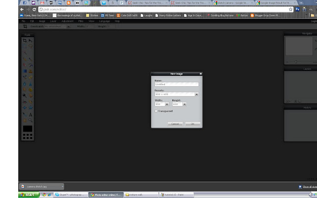
1. first, you'll need to go to pixlr.com and click on 'open photo editor'
then on the next screen, click 'create a new image' which will pop up a little box with the preset width and height. you will need to change the width to somewhere around 1000 depending on the size of your blog and a height of 200 (you can make it bigger if you want to). 


2. you should see this pop up: 


now, when it does that, you are only seeing a certain percentage of the actual header. you CAN work with that if you want to, and the quality will be the same once it's 100%, but it will give you an idea if it's big enough for you blog, or TOO big if you change the percentage to 100%. then you will be viewing the whole thing instead of 84% of it. 

depending on what size your computer screen is, you may not want to do this because you'll have to scroll back and forth a lot. but if it DOES fit on your computer screen i encourage you to do that by...


dragging the 3 menus to the lower part of the screen and then (using the first menu) change 84% to 100%. after you've done that your screen should look something like this:


be sure that you've dragged the bottom right corner of the work area out so that you can see all of the white area. 

3. to add text, click the 'A' on the toolbar on the left side of the screen. then click anywhere in the white area (you can move it around after). 


then you can change the font, font size, font style (bold, italic), and font color using the menu that has popped up. 

4. the fonts that appear in the drop down menu, are all the fonts provided by pixlr AND any extra fonts that you've downloaded on your computer. now, once you have all the fonts that you want, you'll want to move them around right? well it's not as simple as you would think. you have to use the menu on the bottom that is labeled 'layers'. you'll see that everything you've written, has it's own layer. so whatever layer you want to move, just select that layer.


once you have everything where you want it to be, you can add a picture (or a few) if you want to by going to the file menu at the top of the screen and clicking 'open image'.


5. before you open an image, you'll want to save your image if it isn't already saved. for example, if you are getting an image of of google images then you'll need to save it before you put it on your header. once you've opened your image in pixlr. you MAY need to resize it so that it fits on your header.


to do that, go to the image menu at the top of the screen and click 'image size'. your screen will look like this:


just change the height and width so that it will fit where you want it to go on your header. 

6. once your image is the right size, you'll need to save it again. then go to the layer menu at the top of the screen and click 'open image as layer'.


then, use the arrow to move your picture around to the desired spot. 


7. once you have everything in the right place, you'll want to flatten it, and save it. when you flatten it, you're basically gluing all the layers together, so you won't be able to move them around anymore.


once you've flattened your image, you can save it by going to the file menu at the top of the page, and clicking 'save'.


the you can name your header, and save it so that you can upload it to your blog! 


hope this helps! if you have any questions, feel free to comment!

Wednesday, April 4, 2012

what do YOU want?

    As I (Ashlyn) have been finding more time to blog here, I wanted to know what you guys wanted- that is- the followers here. :) Is there something you've been wanting to figure out? I'm not sure exactly what to post about- so let me know in a comment! :)

Wednesday, March 28, 2012

letter spacing- a favorite CSS element of mine...

Hi y'all! Yep, We're actually posting here. :)
   Tonight, I'm covering letter spacing. It's a very unique way to style text.

First of all, you'll write it like this: 

letter-spacing:1px;
Of course, you can edit the 1px part any way you would like! Letter Spacing can be positive or negative- meaning you can say that letter spacing can be 3px or -3px. Be careful using negative- a little goes a long way. Also, too much letter spacing makes a blog hard to read. But it makes an interesting effect when applied to post title hovers, links, and over-all text.

Here are some examples:
letter-spacing: 4px;

letter-spacing: -2px;

You can insert this under any code in your template that specifies text style (example: place it under h3 to give your post-titles letter spacing).

Here's a few sites that used this effect!
Jamie Delaine Blog- her over-all text has letter spacing- more than usual, but just enough.
Discover Life Designs - I used a negative letter spacing on my accordion hover.

This is such a simple element, but it's so much fun. I truly enjoy this one! :) 

Friday, March 2, 2012

three annoying things about minima + how to fix them

---
The Minima template is pretty simple and, as we've said before, perfect for designing, but it has a few minor flaws that you might want to get rid of before you start.

1. header borders.
We know - those pesky double lines around your header can get a little annoying. Here's how to get rid of them.

Search for the code #header-wrapper again. You'll find three sections of code in the same vicinity:
#header-wrapper {
    width:1000px;
    margin:0 auto 10px;
    border:1px solid $bordercolor;
}

#header-inner {
    background-position: center;
    margin-left: auto;
    margin-right: auto;
}

#header {
    margin: 5px;
    border: 1px solid $bordercolor;
    text-align: center;
    color:$pagetitlecolor;
}

See those lines in red? Delete them. Or, you can simply change the number 1 to the number 0. Presto, the borders disappear!

2. uppercase.
One of the other things that bothers people about Minima is all the uppercase letters - do you see them? They're in the header, the dates, the sidebar titles... everywhere. It's perfectly fine to leave your blog this way if you like it, but if you don't, here's how to get rid of it. Search for
text-transform:uppercase;
in your template. We found it 8 times in our Minima template. Now, wherever you want to get rid of the uppercase letters? Delete that line. Piece of cake!

3. post title hover.
An easy way to tell if a fellow blogger has Minima installed is by hovering over the area around their post titles. If the color changes even when your mouse is not directly over the text, chances are it's due to a funny little quirk in the Minima template. Don't like it? Here's how to fix it. Search for
.post h3 a {
in your template. Look at the code underneath it:
.post h3 a, .post h3 a:visited, .post h3 strong {
    display:block;
    text-decoration:none;
    color:$titlecolor;
    font-weight:normal;

Delete the line in red. See? It's so quick and easy, we wonder why nobody else seems to do it. Well, now you know!

Wednesday, February 15, 2012

an in-depth study of margins and paddings.

When we talk about margins and padding, we're talking about spacing - we want to spread out the different sections of your blog design, so everything's not all squished together. Remember that your blog is made up of three main sections: the header-wrapper, the main-wrapper, and the sidebar-wrapper, which all fit into the outer-wrapper.  To sum it up:

 Margins are outside. They are the space between parts of your design. If the margin of your main-wrapper is 15px, then there will be 15px of empty space between your main posting area and your sidebar, where your blog background might show through.

 Padding is the space inside. If the padding of your main-wrapper is 15px, then there will be 15px of extra space around the text of your posts.

It's easiest to explain with a diagram:

On the far right of this diagram, we've illustrated what happens when your padding is zero - the text will go right up against the side of that section of your blog. Of course, this is more noticable when there's a border around your sidebar or posting area.

Let's talk numbers. We usually measure margins and padding in pixels, or px. When you're dealing with margins between your main and sidebar wrappers, you want to make sure you don't make them too wide. Use this formula:

main-wrapper width
+ main-wrapper margins/padding
+ sidebar width
+ sidebar margins/padding
____________________________
= outer wrapper width.

If you just got lost, remember that the main-wrapper is the code that represents your main blog column, and the outer-wrapper is the overall section that includes both your main wrapper and sidebar. We learned how to change the widths in this tutorial.

What happens if your margins are too wide? If those first four widths add up to a number greater than your outer-wrapper width, the sidebar won't have enough room and will wind up at the bottom of your blog. That's no fun!

When you add margins or padding to your blog design, you can do it with several lines of code, or just a few. For example,
margin-top:0px;
margin-right:10px;
margin-bottom:0px;
margin-left:5px;
can become
margin: 0px 10px 0px 5px;
Those numbers set the margins in clockwise order: top, right, bottom, left. It works the same way for padding.

Let's look at an example.

#outer-wrapper {
width: 1000px;
margin:0 auto;
padding:10px 10px 0 10px;
text-align:$startSide;
font: $bodyfont;
background:#ffffff;
}

#main-wrapper {
width: 700px;
float:$startSide;
margin: 0 20px 0 0;
background:white;
padding: 0 15px 0 15px;
border:1px dotted #bb1d07;
border-bottom:1px dotted #bb1d07;
word-wrap: break-word; /* fix for long text breaking sidebar float in IE */
overflow: hidden; /* fix for long non-text content breaking IE sidebar float */

#sidebar-wrapper {
width: 200px;
background: transparent;
float: $startSide;
padding:0 10px 0 10px;
margin: 0 0 0 30px;
word-wrap: break-word; /* fix for long text breaking sidebar float in IE */
overflow: hidden; /* fix for long non-text content breaking IE sidebar float */
}

Here, we chose an easy number for the outer-wrapper: 1000px. The main-wrapper is 700 px, and the sidebar-wrapper is 200, so that leaves an extra 100px left over for margins. (This is probably a little too much space, but we wanted to keep the math easy).

"Auto" is the default margin - if you don't specify a number, then your computer will decide for you. Here, the outer-wrapper margin is 0 auto 0 auto; which means that the top and bottom margins will be 0px and the left and right margins will be equal - it'll end up in the center! Like we said, you don't have to type in "auto" - it's just the automatic setting that stays until you change the numbers.

Notice that the margin-right of the main wrapper is 20px, and the margin-left of the sidebar is 30px. That adds up to 50px of extra space in between the two sections. We filled up the extra pixels with padding: 30px total for the main wrapper, and 20 for the sidebar wrapper. Add up all the margins and widths, and you get 1000px - the same as our outer-wrapper! It's perfect.

All of the top margins are 0 in this example. You won't usually use really weird numbers for top and bottom margins, but you can play around with it if you want.

What's the difference between margins and padding? Well, it's easiest to see if you have a border around that section of your blog - padding goes inside the border, and margins go outside. The other main difference that you might be interested to know is that margins can have negative values, but padding can't. Experiment!

As always, if you have any questions, please feel free to email us at writethegeeks@hotmail.com