
As I (Ashlyn) have been finding more time to blog here, I wanted to know what you guys wanted- that is- the followers here. :) Is there something you've been wanting to figure out? I'm not sure exactly what to post about- so let me know in a comment! :)
Wednesday, April 4, 2012

Wednesday, March 28, 2012
letter spacing- a favorite CSS element of mine...
Hi y'all! Yep, We're actually posting here. :)
Tonight, I'm covering letter spacing. It's a very unique way to style text.
First of all, you'll write it like this:
Tonight, I'm covering letter spacing. It's a very unique way to style text.
First of all, you'll write it like this:
letter-spacing:1px;Of course, you can edit the 1px part any way you would like! Letter Spacing can be positive or negative- meaning you can say that letter spacing can be 3px or -3px. Be careful using negative- a little goes a long way. Also, too much letter spacing makes a blog hard to read. But it makes an interesting effect when applied to post title hovers, links, and over-all text.
Here are some examples:
letter-spacing: 4px;
letter-spacing: -2px;
You can insert this under any code in your template that specifies text style (example: place it under h3 to give your post-titles letter spacing).
Here's a few sites that used this effect!
Jamie Delaine Blog- her over-all text has letter spacing- more than usual, but just enough.
Discover Life Designs - I used a negative letter spacing on my accordion hover.
This is such a simple element, but it's so much fun. I truly enjoy this one! :)
Friday, March 2, 2012
three annoying things about minima + how to fix them
---
The Minima template is pretty simple and, as we've said before, perfect for designing, but it has a few minor flaws that you might want to get rid of before you start.
The Minima template is pretty simple and, as we've said before, perfect for designing, but it has a few minor flaws that you might want to get rid of before you start.
1. header borders.
We know - those pesky double lines around your header can get a little annoying. Here's how to get rid of them.
Search for the code #header-wrapper again. You'll find three sections of code in the same vicinity:
#header-wrapper {
width:1000px;
margin:0 auto 10px;
border:1px solid $bordercolor;
}
#header-inner {
background-position: center;
margin-left: auto;
margin-right: auto;
}
#header {
margin: 5px;
border: 1px solid $bordercolor;
text-align: center;
color:$pagetitlecolor;
}
See those lines in red? Delete them. Or, you can simply change the number 1 to the number 0. Presto, the borders disappear!
2. uppercase.
One of the other things that bothers people about Minima is all the uppercase letters - do you see them? They're in the header, the dates, the sidebar titles... everywhere. It's perfectly fine to leave your blog this way if you like it, but if you don't, here's how to get rid of it. Search for
text-transform:uppercase;in your template. We found it 8 times in our Minima template. Now, wherever you want to get rid of the uppercase letters? Delete that line. Piece of cake!
3. post title hover.
An easy way to tell if a fellow blogger has Minima installed is by hovering over the area around their post titles. If the color changes even when your mouse is not directly over the text, chances are it's due to a funny little quirk in the Minima template. Don't like it? Here's how to fix it. Search for
.post h3 a {in your template. Look at the code underneath it:
.post h3 a, .post h3 a:visited, .post h3 strong {
display:block;
text-decoration:none;
color:$titlecolor;
font-weight:normal;
Delete the line in red. See? It's so quick and easy, we wonder why nobody else seems to do it. Well, now you know!
Wednesday, February 15, 2012
an in-depth study of margins and paddings.
When we talk about margins and padding, we're talking about spacing - we want to spread out the different sections of your blog design, so everything's not all squished together. Remember that your blog is made up of three main sections: the header-wrapper, the main-wrapper, and the sidebar-wrapper, which all fit into the outer-wrapper. To sum it up:
Margins are outside. They are the space between parts of your design. If the margin of your main-wrapper is 15px, then there will be 15px of empty space between your main posting area and your sidebar, where your blog background might show through.
Padding is the space inside. If the padding of your main-wrapper is 15px, then there will be 15px of extra space around the text of your posts.
It's easiest to explain with a diagram:
 On the far right of this diagram, we've illustrated what happens when your padding is zero - the text will go right up against the side of that section of your blog. Of course, this is more noticable when there's a border around your sidebar or posting area.
Let's talk numbers. We usually measure margins and padding in pixels, or px. When you're dealing with margins between your main and sidebar wrappers, you want to make sure you don't make them too wide. Use this formula:
If you just got lost, remember that the main-wrapper is the code that represents your main blog column, and the outer-wrapper is the overall section that includes both your main wrapper and sidebar. We learned how to change the widths in this tutorial.
What happens if your margins are too wide? If those first four widths add up to a number greater than your outer-wrapper width, the sidebar won't have enough room and will wind up at the bottom of your blog. That's no fun!
When you add margins or padding to your blog design, you can do it with several lines of code, or just a few. For example,
Let's look at an example.
"Auto" is the default margin - if you don't specify a number, then your computer will decide for you. Here, the outer-wrapper margin is 0 auto 0 auto; which means that the top and bottom margins will be 0px and the left and right margins will be equal - it'll end up in the center! Like we said, you don't have to type in "auto" - it's just the automatic setting that stays until you change the numbers.
Notice that the margin-right of the main wrapper is 20px, and the margin-left of the sidebar is 30px. That adds up to 50px of extra space in between the two sections. We filled up the extra pixels with padding: 30px total for the main wrapper, and 20 for the sidebar wrapper. Add up all the margins and widths, and you get 1000px - the same as our outer-wrapper! It's perfect.
All of the top margins are 0 in this example. You won't usually use really weird numbers for top and bottom margins, but you can play around with it if you want.
What's the difference between margins and padding? Well, it's easiest to see if you have a border around that section of your blog - padding goes inside the border, and margins go outside. The other main difference that you might be interested to know is that margins can have negative values, but padding can't. Experiment!
As always, if you have any questions, please feel free to email us at writethegeeks@hotmail.com.
Margins are outside. They are the space between parts of your design. If the margin of your main-wrapper is 15px, then there will be 15px of empty space between your main posting area and your sidebar, where your blog background might show through.
Padding is the space inside. If the padding of your main-wrapper is 15px, then there will be 15px of extra space around the text of your posts.
It's easiest to explain with a diagram:
Let's talk numbers. We usually measure margins and padding in pixels, or px. When you're dealing with margins between your main and sidebar wrappers, you want to make sure you don't make them too wide. Use this formula:
main-wrapper width
+ main-wrapper margins/padding
+ sidebar width
+ sidebar margins/padding
____________________________
= outer wrapper width.
If you just got lost, remember that the main-wrapper is the code that represents your main blog column, and the outer-wrapper is the overall section that includes both your main wrapper and sidebar. We learned how to change the widths in this tutorial.
What happens if your margins are too wide? If those first four widths add up to a number greater than your outer-wrapper width, the sidebar won't have enough room and will wind up at the bottom of your blog. That's no fun!
When you add margins or padding to your blog design, you can do it with several lines of code, or just a few. For example,
margin-top:0px;can become
margin-right:10px;
margin-bottom:0px;
margin-left:5px;
margin: 0px 10px 0px 5px;Those numbers set the margins in clockwise order: top, right, bottom, left. It works the same way for padding.
Let's look at an example.
#outer-wrapper {Here, we chose an easy number for the outer-wrapper: 1000px. The main-wrapper is 700 px, and the sidebar-wrapper is 200, so that leaves an extra 100px left over for margins. (This is probably a little too much space, but we wanted to keep the math easy).
width: 1000px;
margin:0 auto;
padding:10px 10px 0 10px;
text-align:$startSide;
font: $bodyfont;
background:#ffffff;
}
#main-wrapper {
width: 700px;
float:$startSide;
margin: 0 20px 0 0;
background:white;
padding: 0 15px 0 15px;
border:1px dotted #bb1d07;
border-bottom:1px dotted #bb1d07;
word-wrap: break-word; /* fix for long text breaking sidebar float in IE */
overflow: hidden; /* fix for long non-text content breaking IE sidebar float */
#sidebar-wrapper {
width: 200px;
background: transparent;
float: $startSide;
padding:0 10px 0 10px;
margin: 0 0 0 30px;
word-wrap: break-word; /* fix for long text breaking sidebar float in IE */
overflow: hidden; /* fix for long non-text content breaking IE sidebar float */
}
"Auto" is the default margin - if you don't specify a number, then your computer will decide for you. Here, the outer-wrapper margin is 0 auto 0 auto; which means that the top and bottom margins will be 0px and the left and right margins will be equal - it'll end up in the center! Like we said, you don't have to type in "auto" - it's just the automatic setting that stays until you change the numbers.
Notice that the margin-right of the main wrapper is 20px, and the margin-left of the sidebar is 30px. That adds up to 50px of extra space in between the two sections. We filled up the extra pixels with padding: 30px total for the main wrapper, and 20 for the sidebar wrapper. Add up all the margins and widths, and you get 1000px - the same as our outer-wrapper! It's perfect.
All of the top margins are 0 in this example. You won't usually use really weird numbers for top and bottom margins, but you can play around with it if you want.
What's the difference between margins and padding? Well, it's easiest to see if you have a border around that section of your blog - padding goes inside the border, and margins go outside. The other main difference that you might be interested to know is that margins can have negative values, but padding can't. Experiment!
As always, if you have any questions, please feel free to email us at writethegeeks@hotmail.com.
Wednesday, January 25, 2012
Widening in Minima- Week 1
In case you haven't noticed, Minima is just a little bit on the skinny side. It must have been the fad back in 06. We've came a long way, baby!
So here's the code Minima uses. From your Edit HTML page, search for (ctrl+f) "#outer-wrapper".
So here's the code Minima uses. From your Edit HTML page, search for (ctrl+f) "#outer-wrapper".
#outer-wrapper {
width: 660px;
margin:0 auto;
padding:10px;
text-align:$startSide;
font: $bodyfont;
}
#main-wrapper {
width: 410px;
float: $startSide;
word-wrap: break-word; /* fix for long text breaking sidebar float in IE */
overflow: hidden; /* fix for long non-text content breaking IE sidebar float */
}
#sidebar-wrapper {
width: 220px;
float: $endSide;
word-wrap: break-word; /* fix for long text breaking sidebar float in IE */
overflow: hidden; /* fix for long non-text content breaking IE sidebar float */
}
You'll need to changed the widths, so here's what will be changed:
#outer-wrapper {
width: 1000px;
margin:0 auto;
padding:10px;
text-align:$startSide;
font: $bodyfont;
}
#main-wrapper {
width: 740px;
float: $startSide;
word-wrap: break-word; /* fix for long text breaking sidebar float in IE */
overflow: hidden; /* fix for long non-text content breaking IE sidebar float */
}
#sidebar-wrapper {
width: 250px;
float: $endSide;
word-wrap: break-word; /* fix for long text breaking sidebar float in IE */
overflow: hidden; /* fix for long non-text content breaking IE sidebar float */
}
Let's give a breakdown on what each of these codes mean:
#outer wrapper: It is the main area that holds both your posting area and sidebar area. It does not include the background area.
#main wrapper: That is the area where your posts appear.
#sidebar wrapper: your sidebar! of course! :)
And that's it! Experiment with different sizes!
Having problems? Email us at writethegeeks@hotmail.com!
Saturday, January 14, 2012
installing a custom image background.
So today, we're going to learn how to do exactly that. This code to CSS, once learned, can be applied just about anywhere, and you'll have endless fun. Whether it be post title hovers, accordion backgrounds, post footers... you name it, you can add a background there, and it will look awesome.

This is what code you'll be using. You can search (ctrl+f) "body." Here's what the codes looks like right before you edit it, in basic Minima.
As you've noticed, we added the tag for a background image. It's a CSS element. (wanna read more?)
This is the tag:
This is what it will look like, after you install it.

It's simple. However, just a few stipulations.
This code, it's similar what Template Designer does for you. If you upload a 200x200px sized image, it will repeat it for you. It will either look awesome or awful. IF you have an image that is the normal size for a background, and you don't want it moving, or repeating itself, then you're going to have to add a few other codes. Don't worry, it's not hard.

You see? It doesn't repeat itself, and it's smack dab in the center.
Another thing you can do to customize your background - change it from fixed to scroll, or vice versa. If your background is fixed, it will stay in the same place while the rest of your page moves when you scroll down. Otherwise, the default is for both parts to scroll down. Just add this line of code:
or switch out the last word for scroll.
So, step by step.
For an Image Background:
If you think this all looks like too many lines of code, here's a hint: you can combine all the background settings into one line.
Make sense? As always, it never will make full sense until you dive right into it and make sense of it yourself... figuring it out. Keep at it.
Questions? Email us at writethegeeks@hotmail.com.
providing it's a good background.
So. To install a background, we need to use this thing called DIRECT LINK for a photo. see here....

I use Photobucket to upload photos. I love how fast it loads. I'd recommend that or Imgur. Whatever you do, don't use Flickr- it's not very dependable for direct links. :)
So. On Photobucket, as illustrated above, when you hover over the photo, that little box pops up. I highlighted the text area for the Direct Link. There's lots of codes there, use the Direct Link. I'm trying to grind that in here. DIRECT LINK.
Okay. This photo's direct link is this: http://i1236.photobucket.com/albums/ff459/iluvcameras/images17.jpg.
You'll be using that as your background for this tutorial. Part of it, anyways.
This is what code you'll be using. You can search (ctrl+f) "body." Here's what the codes looks like right before you edit it, in basic Minima.
/* Use this with templates/template-twocol.html */You'll change it... slightly. You'll add a slight code. Compare!
body {
background:$bgcolor;
margin:0;
color:$textcolor;
font:x-small Georgia Serif;
font-size/* */:/**/small;
font-size: /**/small;
text-align: center;
}
/* Use this with templates/template-twocol.html */
body {
background:$bgcolor url(
http://i1236.photobucket.com/albums/ff459/iluvcameras/images17.jpg);
margin:0;
color:$textcolor;
font:x-small Georgia Serif;
font-size/* */:/**/small;
font-size: /**/small;
text-align: center;
}
As you've noticed, we added the tag for a background image. It's a CSS element. (wanna read more?)
This is the tag:
background:url('your-DIRECT-LINK-here');Just ignore the $bgcolor part, the image will override the color settings.
This is what it will look like, after you install it.

It's simple. However, just a few stipulations.
This code, it's similar what Template Designer does for you. If you upload a 200x200px sized image, it will repeat it for you. It will either look awesome or awful. IF you have an image that is the normal size for a background, and you don't want it moving, or repeating itself, then you're going to have to add a few other codes. Don't worry, it's not hard.
background-repeat:no-repeat;That's just an example. Background-Position can be bottom, top, left, right, top center, bottom center, top right, bottom right, or whatever combination you can come up with. If you do want your background to repeat, just delete that Background-Repeat code. This is what it will look like after adding the above code.
background-position:center;

You see? It doesn't repeat itself, and it's smack dab in the center.
Another thing you can do to customize your background - change it from fixed to scroll, or vice versa. If your background is fixed, it will stay in the same place while the rest of your page moves when you scroll down. Otherwise, the default is for both parts to scroll down. Just add this line of code:
background-position:fixed;
or switch out the last word for scroll.
So, step by step.
For an Image Background:
- Upload your background to an image server- say photobucket.com or imgur.com
- Find the CSS code background: $bgcolor; under "body".
- Copy/Paste the DIRECT LINK into this code, before the semicolon: url('YOUR-DIRECT-LINK-HERE')
- Click preview. If it suits your fancy, click Save.
- Enjoy your new background. :)
background: $bgcolor url(directlink.jpg) repeat scroll top center;
Make sense? As always, it never will make full sense until you dive right into it and make sense of it yourself... figuring it out. Keep at it.
Questions? Email us at writethegeeks@hotmail.com.
Saturday, January 7, 2012
how to install minima
Hello, world, and welcome to Geek Chic! Over the next few weeks, we'll be teaching you to give your blog a head-to-toe makeover. We want to pull away from Template Designer and get you familiar with that "Edit HTML" button. The easiest way to do this is by using the Minima template - it's the original Blogger design, and the HTML is much simpler than in any of the newer templates, making it even simpler to customize.
The one scary thing about Minima is that you can't use Template Designer for most of it. It won't let you upload background images, add or subtract new columns, or change the widths with a slider. But no worries! You'll learn how to do all this and more the old-fashioned way, straight into your blog template. Who's excited? We are!
If you want to redesign your blog, you might want to start by making a test blog. You can mess up the design on a test blog as much as you want, and it won't matter, because nobody will read it! Let's get started.
First off, if you want to install Minima, you'll get a little frustrated with the new Blogger layout. It's just not as designer-friendly as the old version. To fix this, just click the little gear in the top right corner of your dashboard, and click the link to go back to the old interface.
 Now, somewhere near the top right of your dashboard, you should see a link to Create a Blog. Click on it! You can name your blog "test blog" and pick any random URL that you'd like. It doesn't matter.
(click on any image to view larger)

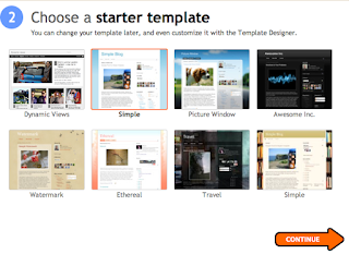
It'll ask you to choose a template - but no Minima here! Just select Simple for now.

Why yes, we do want to customize how our blog looks!
That link takes us back to Template Designer, but what we really want to do is click Back to Blogger and start editing that HTML code.


The one scary thing about Minima is that you can't use Template Designer for most of it. It won't let you upload background images, add or subtract new columns, or change the widths with a slider. But no worries! You'll learn how to do all this and more the old-fashioned way, straight into your blog template. Who's excited? We are!
If you want to redesign your blog, you might want to start by making a test blog. You can mess up the design on a test blog as much as you want, and it won't matter, because nobody will read it! Let's get started.
First off, if you want to install Minima, you'll get a little frustrated with the new Blogger layout. It's just not as designer-friendly as the old version. To fix this, just click the little gear in the top right corner of your dashboard, and click the link to go back to the old interface.
Now, somewhere near the top right of your dashboard, you should see a link to Create a Blog. Click on it! You can name your blog "test blog" and pick any random URL that you'd like. It doesn't matter.(click on any image to view larger)


It'll ask you to choose a template - but no Minima here! Just select Simple for now.
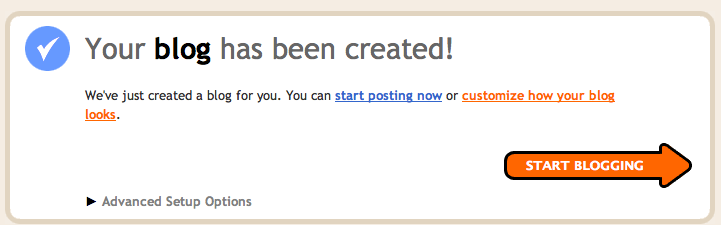
Why yes, we do want to customize how our blog looks!
That link takes us back to Template Designer, but what we really want to do is click Back to Blogger and start editing that HTML code.


On the Edit HTML page, scroll down to the bottom and find the Old Templates section. Click "Select Layout Template."

(in case you were wondering, the classic template is Minima without the option to add and edit widgets. scary!)

Select the first template, Minima, and click Save.
And you're done! You can mess around in Template Designer a little, but you'll find there isn't really much to do.
Stay tuned for tutorials on how to start customizing your new Minima template!
Subscribe to:
Posts (Atom)
